
作者 / Jolanda Verhoef
许多应用都提供某种形式的多选功能,有时您可以拖动以选择一系列元素。例如,您可以在 Google 相册中轻松地选择一系列照片来分享、添加到某个相册或将其删除。在本文中,我们将以此为最终目标来实现类似的功能:

△ 具有多选功能的精美图像网格
为了实现这种最终效果,我们将采取以下步骤:
-
实现一个基本网格
-
为网格元素添加选择状态
-
添加手势处理,以便我们可以通过拖动以选择/取消选择
-
最后进行一些润色 ,让元素看起来像照片
您可以查看 完整的代码示例!
实现网格
我们将此网格实现为 LazyVerticalGrid,以便应用在各种屏幕尺寸上都能正常运行。较大屏幕将显示更多的列,较小屏幕则显示较少的列。
@Composable
private fun PhotoGrid() {
  val photos by rememberSaveable { mutableStateOf(List(100) { it }) }

  LazyVerticalGrid(
    columns = GridCells.Adaptive(minSize = 128.dp),
    verticalArrangement = Arrangement.spacedBy(3.dp),
    horizontalArrangement = Arrangement.spacedBy(3.dp)
  ) {
    items(photos, key = { it }) {
      Surface(
        tonalElevation = 3.dp,
        modifier = Modifier.aspectRatio(1f)
      ) {}
    }
  }
}
尽管我们目前只是显示一个简单的彩色 Surface,但我们已经将元素称为 photos。仅仅通过这几行代码,我们便已经创建了一个可以滚动的漂亮网格:

△ 有助于我们开始构建的基础网格
添加选择状态
但是,简单的网格并不能让我们在多选之旅中走得太远。我们需要追踪当前选择的项目并确定我们是否处于选择模式,然后使我们的元素反映出这种状态。
首先,让我们将网格项目提取到他们自己的可组合项中,以反映其选择状态。此可组合项将显示以下内容:
-
如果用户不处于选择模式,则为空
-
如果用户处于选择模式但未选中元素,显示空的单选按钮
-
如果用户处于选择模式且已选中元素,显示对勾符号
@Composable
private fun ImageItem(
  selected: Boolean, inSelectionMode: Boolean, modifier: Modifier
) {
  Surface(
    tonalElevation = 3.dp,
    contentColor = MaterialTheme.colorScheme.primary,
    modifier = modifier.aspectRatio(1f)
  ) {
    if (inSelectionMode) {
      if (selected) {
        Icon(Icons.Default.CheckCircle, null)
      } else {
        Icon(Icons.Default.RadioButtonUnchecked, null)
      }
    }
  }
}
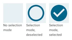
△ 项目的多种选择状态
这个可组合项是 无状态 的,因为它本身不含任何状态,只会反映您传递给它的状态。
为了让项目响应其所选状态,网格应能追踪这些状态。此外,用户应该能够通过与网格中的项目进行交互来更改选定的值。现在,当用户点击一个项目时,我们将简单地切换该项目的选定状态:
@Composable
private fun PhotoGrid() {
  val photos by rememberSaveable { mutableStateOf(List(100) { it }) }
  val selectedIds = rememberSaveable { mutableStateOf(emptySet<Int>()) } // NEW
  val inSelectionMode by remember { derivedStateOf { selectedIds.value.isNotEmpty() } } // NEW


  LazyVerticalGrid(
    columns = GridCells.Adaptive(minSize = 128.dp),
    verticalArrangement = Arrangement.spacedBy(3.dp),
    horizontalArrangement = Arrangement.spacedBy(3.dp)
  ) {
    items(photos, key = { it }) { id ->
      val selected = selectedIds.value.contains(id) // NEW
      ImageItem(selected, inSelectionMode, Modifier.clickable { // NEW
        selectedIds.value = if (selected) {
          selectedIds.value.minus(id)
        } else {
          selectedIds.value.plus(id)
        }
      })
    }
  }
}
我们可以在集合中追踪选定项目。若用户点击任一 ImageItem 实例,该项目的 ID 将添加至集合或从集合中移除。
我们可以通过检查目前是否有任何选定的元素,来确定我们是否处于选择模式。每当选中 ID 的集合发生变化时,此变量都将被重新计算。
借助这项新增功能,我们现在可以通过点击元素将其加入选择或从选择中移除:
△ 这看上去像是一个有趣的井字棋游戏!
手势处理
鉴于正在追踪状态,我们可以实现从选择中添加和删除元素的正确手势。要求如下所示:
- 长按 某个元素以进入选择模式
- 长按后 拖动,以添加所有元素或移除起始元素和目标元素之间的所有元素
- 进入选择模式后,通过 点击 添加或移除相应元素
- 长按 已选中的元素不会执行任何操作
第二个要求是最棘手的。由于我们必须在拖动过程中调整所选 ID 的集合,因此需要向网格 (而非元素本身) 添加手势处理。我们需要自行进行命中检测,以确定光标目前指向网格当中的哪个元素。我们可以通过 LazyGridState 和拖动变更位置的组合来实现。
首先,让我们从延迟网格中提取出 LazyGridState,然后将其传递到我们的自定义手势处理程序。这样有助于我们读取网格信息并将其用于其他位置。更确切来说,我们可以使用这些信息来确定用户目前指向网格中的哪个元素。
@Composable
private fun PhotoGrid() {
  val photos by rememberSaveable { mutableStateOf(List(100) { it }) }
  val selectedIds = rememberSaveable { mutableStateOf(emptySet<Int>()) }
  val inSelectionMode by remember { derivedStateOf { selectedIds.value.isNotEmpty() } }

  val state = rememberLazyGridState() // NEW

  LazyVerticalGrid(
    state = state, // NEW
    columns = GridCells.Adaptive(minSize = 128.dp),
    verticalArrangement = Arrangement.spacedBy(3.dp),
    horizontalArrangement = Arrangement.spacedBy(3.dp),
    modifier = Modifier.photoGridDragHandler(state, selectedIds) // NEW
  ) {
    //..
  }
}
我们可以利用 pointerInput 修饰符和 detectDragGesturesAfterLongPress 方法来设置拖动处理:
fun Modifier.photoGridDragHandler(
  lazyGridState: LazyGridState,
  selectedIds: MutableState<Set<Int>>
) = pointerInput(Unit) {
  var initialKey: Int? = null
  var currentKey: Int? = null
  detectDragGesturesAfterLongPress(
    onDragStart = { offset -> .. },
    onDragCancel = { initialKey = null },
    onDragEnd = { initialKey = null },
    onDrag = { change, _ -> .. }
  )
}
正如这段代码所示,我们正在手势处理程序内部追踪 initialKey 和 currentKey。我们需要在拖动开始时设置初始键,并在用户使用光标移动到不同元素时更新当前键。
让我们首先来实现 onDragStart:
onDragStart = { offset ->
  lazyGridState.gridItemKeyAtPosition(offset)?.let { key -> // #1
    if (!selectedIds.value.contains(key)) { // #2
      initialKey = key
      currentKey = key
      selectedIds.value = selectedIds.value + key // #3
    }
  }
}
循序渐进,您会发现此方法可以执行以下操作:
-
查找光标下方项目的键 (如有)。这表示用户正在长按该元素并将从该元素开始执行拖动手势。
-
如果此方法找到了某个项目 (用户正在指向网格中的某个元素),便会检查此项目是否仍未被选中 (从而满足要求 4)。
-
将初始键和当前键均设置为此键值,并主动将其添加到选定元素列表中。
我们必须自行实现辅助方法 gridItemKeyAtPosition:
// The key of the photo underneath the pointer. Null if no photo is hit by the pointer.
fun LazyGridState.gridItemKeyAtPosition(hitPoint: Offset): Int? =
  layoutInfo.visibleItemsInfo.find { itemInfo ->
    itemInfo.size.toIntRect().contains(hitPoint.round() - itemInfo.offset)
  }?.key as? Int
对于网格中的每个可见项目,此方法会检查 hitPoint 是否落在其范围内。
现在,我们只需更新用户在屏幕上移动其光标时系统会定期调用的 onDrag lambda 函数即可:
onDrag = { change, _ ->
  if (initialKey != null) {
    // Add or remove photos from selection based on drag position
    lazyGridState.gridItemKeyAtPosition(change.position)?.let { key ->
      if (currentKey != key) {
        selectedIds.value = selectedIds.value
          .minus(initialKey!!..currentKey!!)
          .minus(currentKey!!..initialKey!!)
          .plus(initialKey!!..key)
          .plus(key..initialKey!!)
        currentKey = key
      }
    }
  }
}
拖动操作只有在设置了初始键时才会被处理。此 lambda 函数将会根据初始键和当前键更新所选项目的集合。这样做可以确保初始键与当前键之间的所有元素均被选中。
完成此设置后,我们现在就可以拖动选择多个元素了:
△ 为对勾符号加入拖动支持
最后,我们需要替换单个元素的可点击行为,以便在选择模式下添加或移除元素。现在也是开始考虑此手势处理程序的无障碍功能的最佳时间。我们使用 pointerInput 修饰符创建的自定义拖动手势不具备无障碍功能支持,因此 Talkback 等服务将不包括长按和拖动行为。相反,我们可以为要使用无障碍服务的用户提供替代的选择机制,让他们通过长按元素进入选择模式。我们通过设置 onLongClick 语义属性 来实现这一点。
ImageItem(inSelectionMode, selected, Modifier
  .semantics {
    if (!inSelectionMode) {
      onLongClick("Select") {
        selectedIds.value += id
        true
      }
    }
  }
  .then(if (inSelectionMode) {
    Modifier.toggleable(
      value = selected,
      interactionSource = remember { MutableInteractionSource() },
      indication = null, // do not show a ripple
      onValueChange = {
        if (it) {
          selectedIds.value += id
        } else {
          selectedIds.value -= id
        }
      }
    )
  } else Modifier)
)
semantics 修饰符让您可以覆盖或添加无障碍服务所使用的属性和操作处理程序,以便在不依赖触摸的情况下与屏幕交互。大多数情况下,Compose 系统会自动为您处理此行为,但在这种情况下,我们需要特意添加长按行为。
此外,通过对项目使用 toggleable 修饰符 (并且仅在用户处于选择模式时添加),我们能够确保 Talkback 可以向用户提供有关项目当前所选状态的信息。
在拖动过程中增加滚动功能
正如您在之前的屏幕录制中所看到的,我们目前只能拖动到屏幕的顶部和底部边缘。这限制了选择机制的功能。当光标接近屏幕边缘时,我们希望网格能够滚动。另外,用户的光标越靠近屏幕边缘,网格的滚动速度应越快。
理想的最终效果如下所示:
△ 数不清的对勾符号!
首先,我们将更改拖动处理程序,使其能够根据容器顶部或底部的距离来设置滚动速度:
fun Modifier.photoGridDragHandler(
  lazyGridState: LazyGridState,
  selectedIds: MutableState<Set<Int>>,
  autoScrollSpeed: MutableState<Float>,
  autoScrollThreshold: Float
) = pointerInput(Unit) {
  //..
  detectDragGesturesAfterLongPress(
    onDragStart = { offset -> .. },
    onDragCancel = { initialKey = null; autoScrollSpeed.value = 0f },
    onDragEnd = { initialKey = null; autoScrollSpeed.value = 0f },
    onDrag = { change, _ ->
      if (initialKey != null) {
        // NEW
        // If dragging near the vertical edges of the grid, start scrolling
        val distFromBottom =
          lazyGridState.layoutInfo.viewportSize.height - change.position.y
        val distFromTop = change.position.y
        autoScrollSpeed.value = when {
          distFromBottom < autoScrollThreshold -> autoScrollThreshold - distFromBottom
          distFromTop < autoScrollThreshold -> -(autoScrollThreshold - distFromTop)
          else -> 0f
        }

        // Add or remove photos from selection based on drag position
        lazyGridState.gridItemKeyAtPosition(change.position)
          ?.let { key -> .. }
        }
      }
    }
  )
}
如您所见,我们会基于阈值和距离更新滚动速度,并确保在拖动结束或取消时重置滚动速度。
但是从手势处理程序中更改滚动速度值目前还未起效。我们需要更新 PhotoGrid 可组合项,才能开始在值发生变化时滚动网格:
@Composable
private fun PhotoGrid() {
  //..

  // How fast the grid should be scrolling at any given time. The closer the
  // user moves their pointer to the bottom of the screen, the faster the scroll.
  val autoScrollSpeed = remember { mutableStateOf(0f) }
  // Executing the scroll
  LaunchedEffect(autoScrollSpeed.floatValue) {
    if (autoScrollSpeed.floatValue != 0f) {
      while (isActive) {
        state.scrollBy(autoScrollSpeed.floatValue)
        delay(10)
      }
    }
  }

  LazyVerticalGrid(
    //..
    modifier = Modifier.photoGridDragHandler(
      lazyGridState = state,
      selectedIds = selectedIds,
      autoScrollSpeed = autoScrollSpeed, // NEW
      autoScrollThreshold = with(LocalDensity.current) { 40.dp.toPx() } // NEW
    )
  ) {
    items(photos, key = { it }) { id ->
      //..
    }
  }
}
每当滚动速度变量值发生变化时,LaunchedEffect 便会重新触发,滚动也将重新开始。
您可能疑惑我们为什么不直接从 onDrag 处理程序更改滚动等级。原因在于 onDrag lambda 函数只有在用户实际移动光标时才会被调用!因此,如果用户的手指在屏幕上保持静止不动,滚动就会停止。或许您之前已经注意到了应用中的这种滚动错误,此时您需要 "拖动" 屏幕底部才能让其继续滚动。
最后的润色
通过最后的润色,网格的行为变得非常稳定。但是,它看起来不太像我们在本文开头时所举的例子。因此,让我们确保网格项目能够反映实际照片:
private class Photo(val id: Int, val url: String)

@Composable
private fun PhotoGrid() {
  val photos by rememberSaveable {
    mutableStateOf(List(100) { Photo(it, randomSampleImageUrl()) })
  }
  ..
}

/**
* A square image that can be shown in a grid, in either selected or deselected state.
*/
@Composable
private fun ImageItem(
  photo: Photo,
  inSelectionMode: Boolean,
  selected: Boolean,
  modifier: Modifier = Modifier
) {
  Surface(
    modifier = modifier.aspectRatio(1f),
    tonalElevation = 3.dp
  ) {
    Box {
      val transition = updateTransition(selected, label = "selected")
      val padding by transition.animateDp(label = "padding") { selected ->
        if (selected) 10.dp else 0.dp
      }
      val roundedCornerShape by transition.animateDp(label = "corner") { selected ->
        if (selected) 16.dp else 0.dp
      }

      Image(
        painter = rememberAsyncImagePainter(photo.url),
        contentDescription = null,
        modifier = Modifier
          .matchParentSize()
          .padding(padding.value)
          .clip(RoundedCornerShape(roundedCornerShape.value))
      )
      if (inSelectionMode) {
        if (selected) {
          val bgColor = MaterialTheme.colorScheme.surfaceColorAtElevation(3.dp)
          Icon(
            Icons.Filled.CheckCircle,
            tint = MaterialTheme.colorScheme.primary,
            contentDescription = null,
            modifier = Modifier
              .padding(4.dp)
              .border(2.dp, bgColor, CircleShape)
              .clip(CircleShape)
              .background(bgColor)
          )
        } else {
          Icon(
            Icons.Filled.RadioButtonUnchecked,
            tint = Color.White.copy(alpha = 0.7f),
            contentDescription = null,
            modifier = Modifier.padding(6.dp)
          )
        }
      }
    }
  }
}

fun randomSampleImageUrl() = "https://picsum.photos/seed/${(0..100000).random()}/256/256"
如您所见,我们扩展了照片列表,使其不仅包含 ID 还包含 URL。我们可以使用该 URL 加载网格项中的图像。在选择模式之间切换时,图像的内边距和边角形状都会发生变化,我们可以使用动画来让这种变化看起来十分流畅。

△ 最终完美实现!
结论
您可在此 GitHub 代码段 中查看完整代码。我们使用不到 200 行代码,创建了一个包含丰富互动的强大界面。
版权声明
禁止一切形式的转载-禁止商用-禁止衍生 申请授权
